Implementing Skip Links and Focus Management Properly
Keyboard accessibility is not just about making buttons respond to the Tab key.
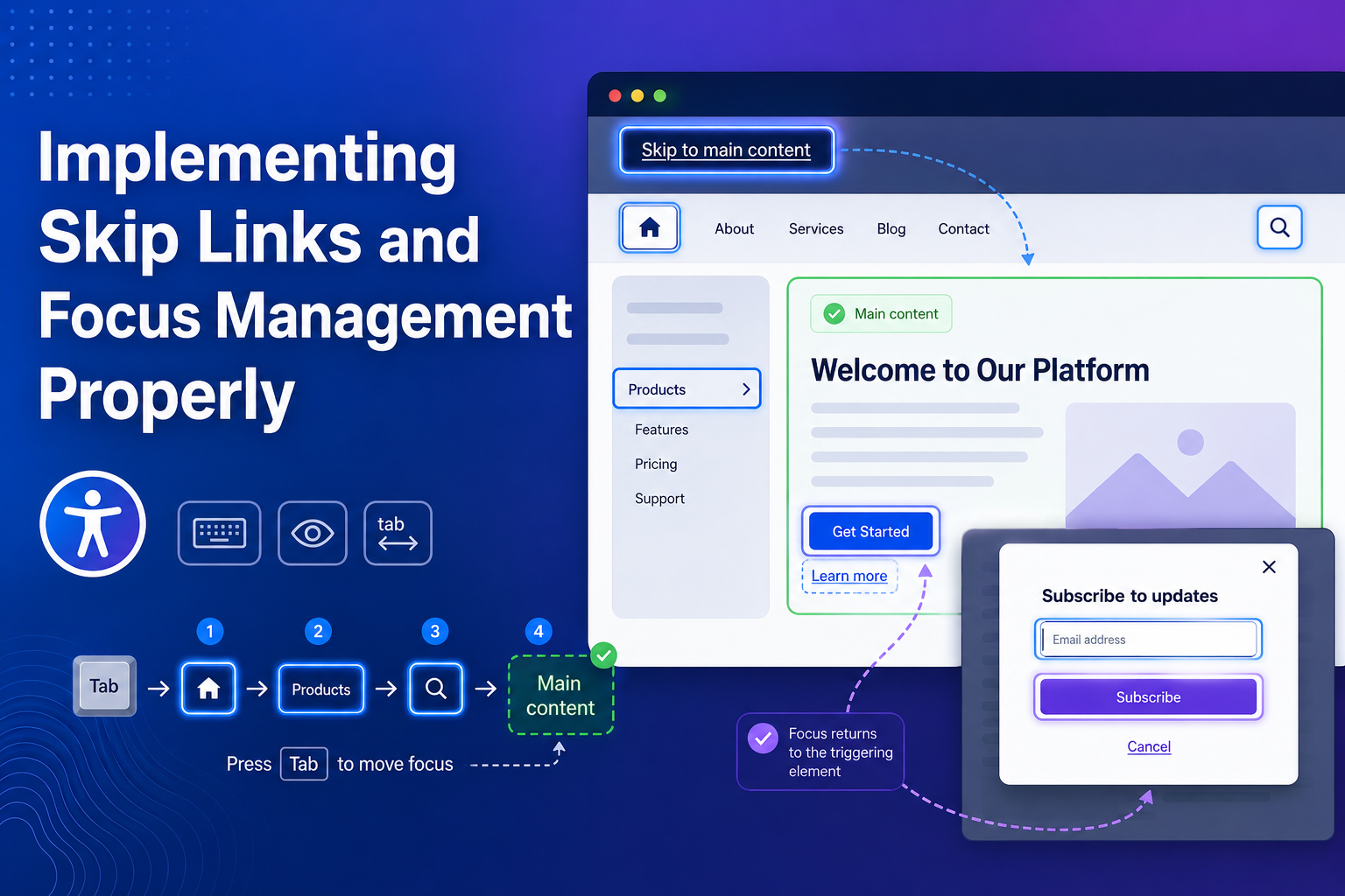
Users also need an efficient way to bypass repeated navigation, understand where keyboard focus is, and maintain their position when dialogs, forms, or dynamic content change.
Good focus management accessibility makes keyboard navigation predictable instead of forcing users to repeatedly search for their place.
In this tutorial, we'll implement skip links, visible focus states, modal focus handling, form-error focus, and focus behavior for dynamic pages.
Why Focus Management Matters
Imagine navigating a site without a mouse.
Every page contains:
Logo
↓
Navigation Link 1
↓
Navigation Link 2
↓
Navigation Link 3
↓
More Header Controls
↓
Finally, Main Content
Repeating this on every page becomes frustrating.
WCAG 2.2 Success Criterion 2.4.1 Bypass Blocks requires a mechanism for bypassing repeated content, while 2.4.3 Focus Order requires keyboard focus to move in an order that preserves meaning and usability.
Step 1: Add a Skip Link
Place the skip link near the beginning of the page:
<body>
  <a class="skip-link" href="#main-content">
    Skip to main content
  </a>

  <header>
    <!-- Navigation -->
  </header>

  <main id="main-content">
    <h1>Dashboard</h1>
  </main>
</body>
When activated, the link moves the user past repeated navigation and directly to the primary content.
This is one of the standard techniques recommended by W3C for bypassing repeated page sections.
Step 2: Hide the Skip Link Until It Receives Focus
The skip link does not need to stay visually prominent all the time.
Hide it off-screen and reveal it when keyboard focus reaches it:
.skip-link {
  position: absolute;
  left: 1rem;
  top: -100px;
  padding: 0.75rem 1rem;
  background: #ffffff;
  color: #111111;
  z-index: 1000;
}

.skip-link:focus {
  top: 1rem;
}
Now a keyboard user can press Tab and immediately see:
[ Skip to main content ]
Avoid hiding the link with:
display: none;
or:
visibility: hidden;
because that removes it from keyboard navigation.
Step 3: Make the Target Reliably Focusable
For applications where you explicitly manage focus, you can make the main region programmatically focusable:
<main id="main-content" tabindex="-1">
  <h1>Dashboard</h1>
</main>
tabindex="-1" allows JavaScript or fragment navigation to focus the element without placing it in the normal Tab sequence.
This distinction is important:
tabindex="0"
→ Included in normal Tab navigation

tabindex="-1"
→ Programmatically focusable

tabindex="1" or higher
→ Avoid
WAI's keyboard guidance strongly advises against using positive tabindex values to control page focus order.
Instead, keep the DOM structure itself logical.
Step 4: Keep Focus Indicators Visible
Never remove focus styling without replacing it.
This is problematic:
button:focus {
  outline: none;
}
A keyboard user may no longer know which button is active.
Use a clear focus indicator instead:
button:focus-visible,
a:focus-visible,
input:focus-visible {
  outline: 3px solid currentColor;
  outline-offset: 3px;
}
:focus-visible is useful because browsers can show the stronger indicator when keyboard-style focus needs to be communicated.
Accessible focus states should also be considered during interface design, not only during development. Well-planned UI/UX design can help teams build keyboard-friendly interfaces, accessible components, and WCAG-aligned user experiences.
Step 5: Manage Focus When Opening a Dialog
Dynamic interfaces require more deliberate focus management.
Suppose a user activates:
[Delete Account]
and a confirmation dialog opens.
Focus should not remain somewhere behind the dialog.
Using the native <dialog> element:
<button id="open-dialog">
  Delete Account
</button>

<dialog id="confirm-dialog">
  <h2>Delete account?</h2>

  <button id="confirm-delete">
    Delete
  </button>

  <button id="close-dialog">
    Cancel
  </button>
</dialog>
JavaScript:
const dialog =
  document.querySelector("#confirm-dialog");

const openButton =
  document.querySelector("#open-dialog");

const closeButton =
  document.querySelector("#close-dialog");

openButton.addEventListener("click", () => {
  dialog.showModal();
});

closeButton.addEventListener("click", () => {
  dialog.close();
});

dialog.addEventListener("close", () => {
  openButton.focus();
});
The important flow is:
Delete Button
     ↓
Dialog Opens
     ↓
Focus Moves Into Dialog
     ↓
User Completes/Closes Dialog
     ↓
Focus Returns to Trigger
WAI guidance emphasizes maintaining predictable focus and restoring it logically when focused content disappears or closes.
For complex custom dialogs, use a proven accessible component pattern rather than inventing your own focus trap.
Step 6: Handle Focus After Content Is Removed
Suppose a task list contains:
Task A
Task B [Delete]
Task C
If the user deletes Task B, its delete button disappears.
Leaving focus on a removed DOM element can cause the browser to fall back to the document body, making keyboard navigation confusing.
Move focus somewhere logical instead:
deleteButton.addEventListener("click", () => {
  const nextTask =
    task.nextElementSibling ||
    task.previousElementSibling;

  task.remove();

  const nextButton =
    nextTask?.querySelector("button");

  nextButton?.focus();
});
The exact destination depends on the interface, but the principle remains:
After an action changes the UI, focus should land somewhere that makes sense.
WAI specifically identifies removed focused elements as situations where developers need to manage focus.
Step 7: Manage Focus After Form Errors
Consider a long registration form.
If validation fails, showing red borders alone may not help keyboard or screen-reader users understand what happened.
Create an error summary:
<div
  id="error-summary"
  tabindex="-1"
  role="alert"
>
  <h2>There are 2 errors</h2>

  <ul>
    <li>
      <a href="#email">
        Enter a valid email address
      </a>
    </li>
  </ul>
</div>
Then move focus to it after validation:
const errorSummary =
  document.querySelector("#error-summary");

errorSummary.focus();
The user immediately learns that validation failed and can follow links to individual fields.
Step 8: Manage Focus in Single-Page Applications
Traditional navigation usually gives users a clear page transition.
Single-page applications can replace content without producing the same browser behavior.
For example:
Products
   ↓
User clicks "Account"
   ↓
URL changes
   ↓
New content appears
If focus remains on the old navigation link, a screen-reader or keyboard user may not immediately know that the page changed.
One approach is to focus the new page heading:
<h1 id="page-heading" tabindex="-1">
  My Account
</h1>
After navigation:
document
  .querySelector("#page-heading")
  .focus();
A sensible SPA pattern is therefore:
Route Changes
      ↓
Update Page Content
      ↓
Update Document Title
      ↓
Move Focus to Main Heading
Do not move focus after every small UI update.
Use programmatic focus when it helps users understand a meaningful context change.
Step 9: Keep Focused Elements Visible
Sticky headers, cookie banners, and fixed toolbars can accidentally cover the element that receives focus.
For example:
┌──────────────────────────┐
│     Sticky Header        │
├──────────────────────────┤
│ Hidden Focused Button    │
│                          │
│ Main Content             │
└──────────────────────────┘
CSS such as this can help with anchored content:
html {
  scroll-padding-top: 6rem;
}
WCAG 2.2 added 2.4.11 Focus Not Obscured (Minimum) at Level AA, requiring a focused component not to be entirely hidden by author-created content.
Test sticky UI carefully with keyboard navigation.
Step 10: Use Native HTML Before ARIA
Do not make everything manually focusable.
Instead of:
<div
  role="button"
  tabindex="0"
>
  Save
</div>
prefer:
<button>
  Save
</button>
Native controls already provide much of the expected:
Keyboard behavior
Focus handling
Semantics
Browser support
Assistive-technology integration
Custom ARIA widgets require developers to implement their expected keyboard behavior themselves.
WAI's Authoring Practices explicitly notes this responsibility.
Consistent keyboard-friendly web development helps teams implement semantic HTML, logical focus order, screen-reader support, and accessible interactive components across the application.
Use ARIA when necessary, not as a replacement for semantic HTML.
A Practical Focus Management Checklist
Before shipping an interface, test it using only your keyboard:
Can I reach every interactive control?
        ↓
Is the focus indicator always visible?
        ↓
Does Tab order make sense?
        ↓
Can I bypass repeated navigation?
        ↓
Does focus enter dialogs correctly?
        ↓
Does focus return when dialogs close?
        ↓
Does dynamic content preserve my position?
        ↓
Are focused elements visible?
If any answer is no, the interface probably needs more focus-management work.
Common Accessibility Mistakes
Avoid these patterns:
Removing
outlinewithout providing another focus styleUsing positive
tabindexvalues to reorder controlsMoving focus unnecessarily
Forgetting to restore focus after closing dialogs
Allowing focus to remain on deleted elements
Hiding skip links with
display: noneCreating clickable
<div>elements instead of buttonsAllowing sticky content to cover focused controls
Testing accessibility only with a mouse
WAI recommends that all interactive functionality remain keyboard operable and that focus movement stay visible and predictable.
Final Thoughts
Good focus management accessibility is mostly about predictability.
Keyboard users should always be able to answer three questions:
Where am I? What can I do here? Where will I go next?
Start with semantic HTML and a correctly implemented skip link.
Preserve the browser's natural focus order wherever possible, provide strong visible focus states, and move focus programmatically only when an interface change genuinely requires it.
Skip links may look like a small accessibility feature, but combined with thoughtful focus management, they make complex websites significantly easier to navigate.